In print design and signage, fonts are powerful communication tools that convey your brand personality and message.
At EXBO, we understand that choosing the right typeface impacts how your audience perceives your brand. Let’s explore the main categories of print fonts and when to use them effectively.
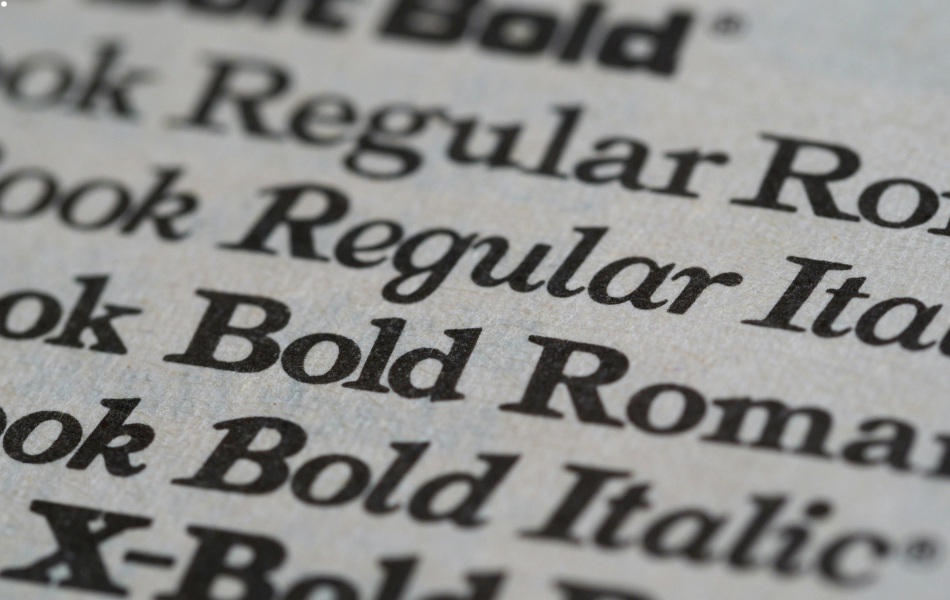
Serif Fonts: Timeless Elegance
Serif fonts feature small decorative strokes, called serifs, at the ends of letters. These classic typefaces create a sense of tradition, reliability, and professionalism.
Popular examples include:
- Times New Roman
- Georgia
- Baskerville
- Garamond
Serif fonts are widely used in formal documents, academic materials, and traditional business communications.
Their distinctive character shapes make them highly readable in lengthy printed text, which is why they’re often chosen for books, newspapers, and detailed brochures.
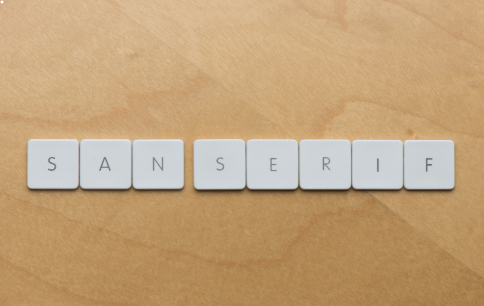
Sans Serif Fonts: Modern Simplicity
Sans serif fonts, literally meaning “without serifs”, lack the decorative strokes, resulting in clean, straightforward letterforms.
These fonts project a modern, minimalist aesthetic that feels approachable and contemporary.
Well-known sans serif fonts include:
- Helvetica
- Arial
- Futura
- Gotham
At EXBO, we often recommend sans serif fonts for signage & displays, and contemporary marketing materials where clarity and immediate impact are essential.
Their simplified shapes maintain legibility even at smaller sizes or from greater distances.
Script Fonts: Elegant Personality
Script fonts mimic handwriting or calligraphy, adding a personal, elegant touch to printed materials.
They range from formal, flowing calligraphy to casual, relaxed handwriting styles.
Popular script fonts include:
- Brush Script
- Zapfino
- Dancing Script
- Great Vibes
These fonts work well for invitations, certificates, and special event materials. However, we advise using them sparingly and at larger sizes to maintain readability.
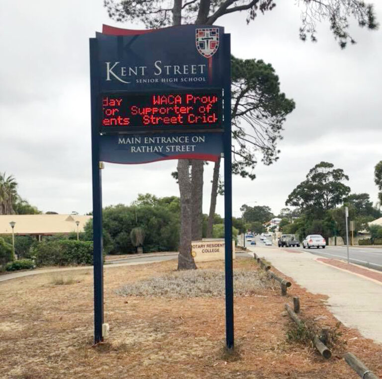
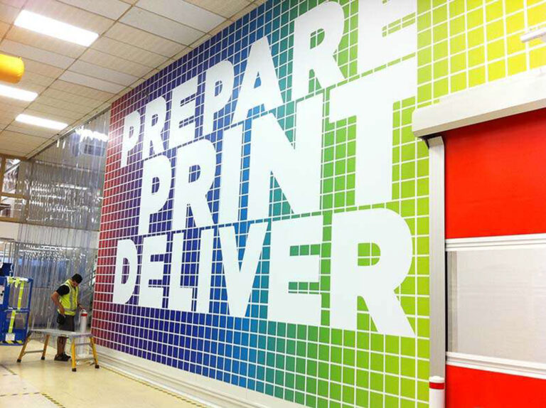
Display Fonts: Making a Statement
Display fonts are designed specifically for headlines, titles, and attention-grabbing text. They’re often bold, decorative, and highly distinctive, making them perfect for creating visual impact.
Examples include:
- Impact
- Cooper Black
- Rockwell
- Bebas Neue
These fonts are ideal for signage, posters, and large-format displays where visibility and memorability are crucial.
Our team at EXBO can help you select the correct display font that captures attention while maintaining alignment with your brand identity.
Monospaced Fonts: Technical Precision
In monospaced fonts, each character occupies the same amount of horizontal space. This creates a technical, precise appearance that works well for specific applications.
Common monospaced fonts include:
- Courier
- Consolas
- Monaco
- Roboto Mono
These fonts are popular for code displays, technical documentation, and data presentations where alignment is critical.
Choosing the Right Font for Your Project
Selecting the appropriate font family is a significant part of the design process in any print or signage project.
The right typeface not only enhances readability but also reinforces your brand’s personality and message.
At EXBO, we combine our 120 years of collective experience with contemporary design knowledge to help you make informed font choices.
Whether you’re creating corporate signage, retail displays, or marketing materials, we understand how typography contributes to effective communication.

Contact
Get In Touch
Top Products